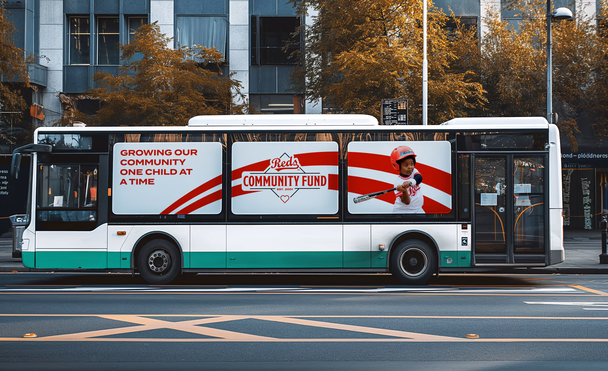
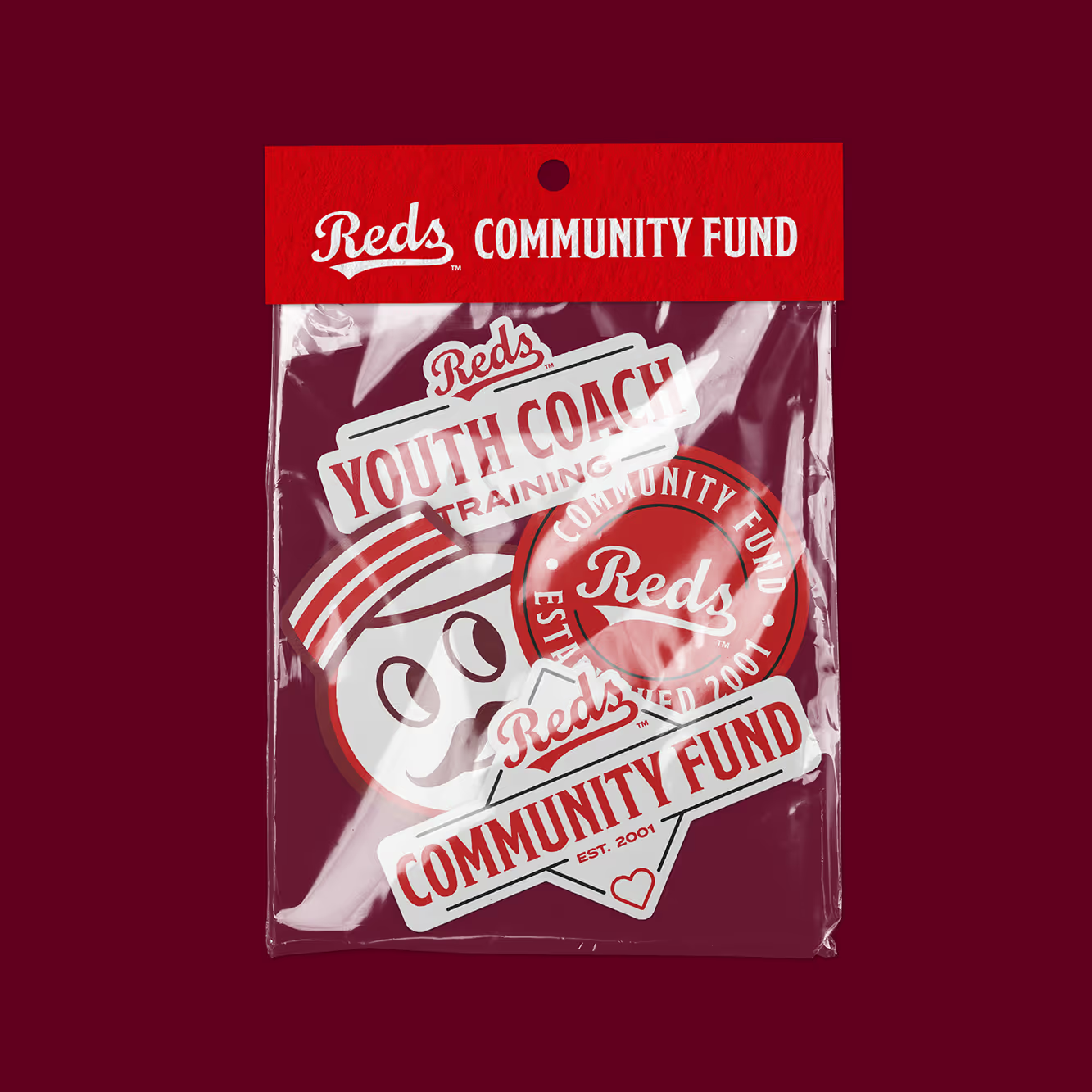
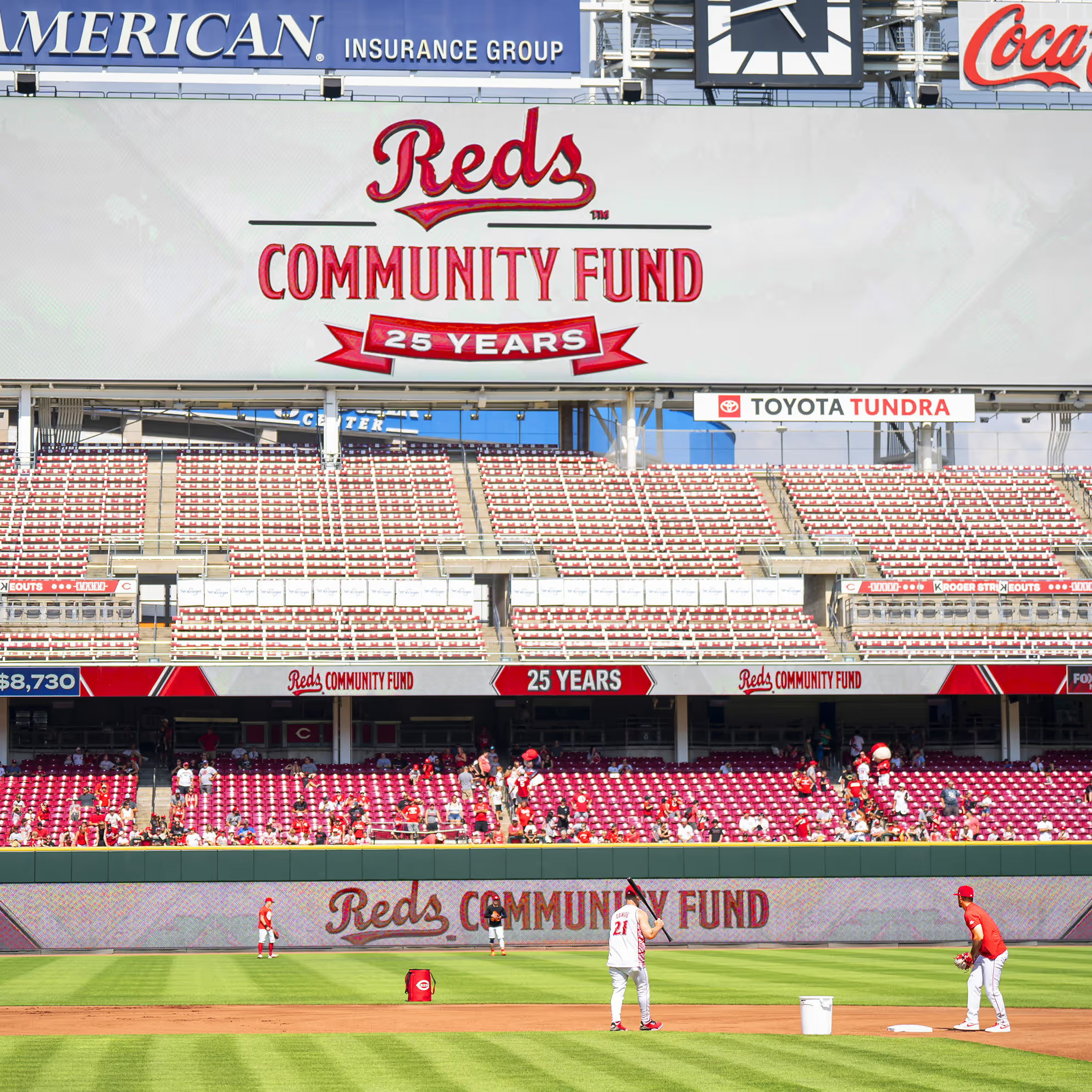
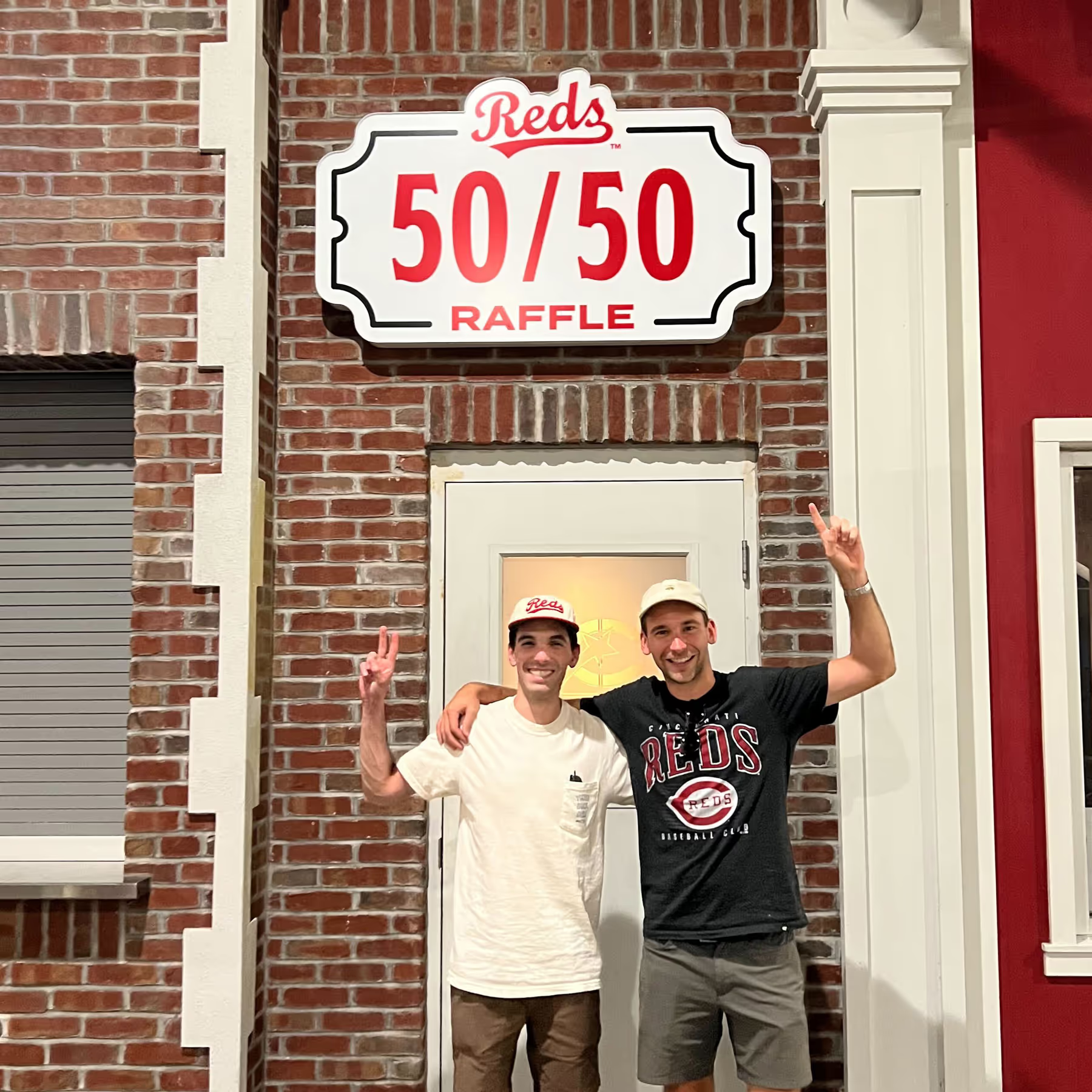
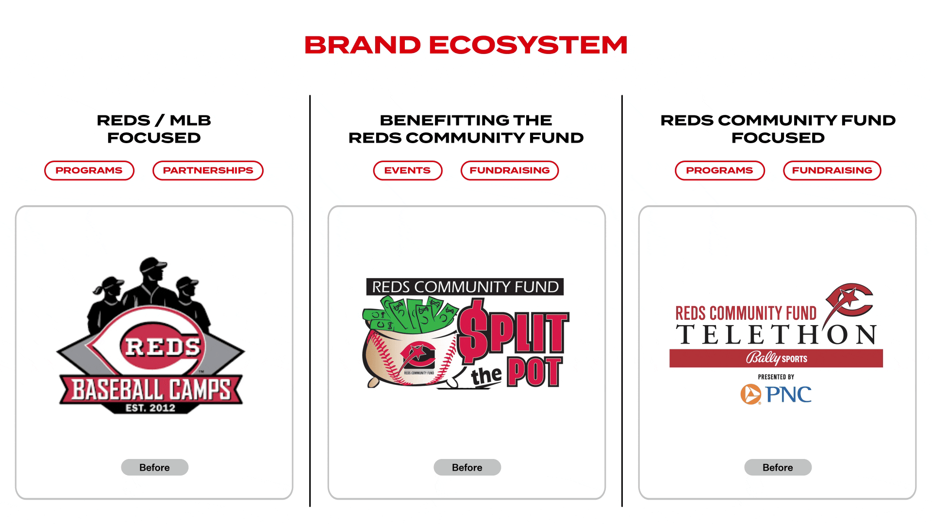
Branding

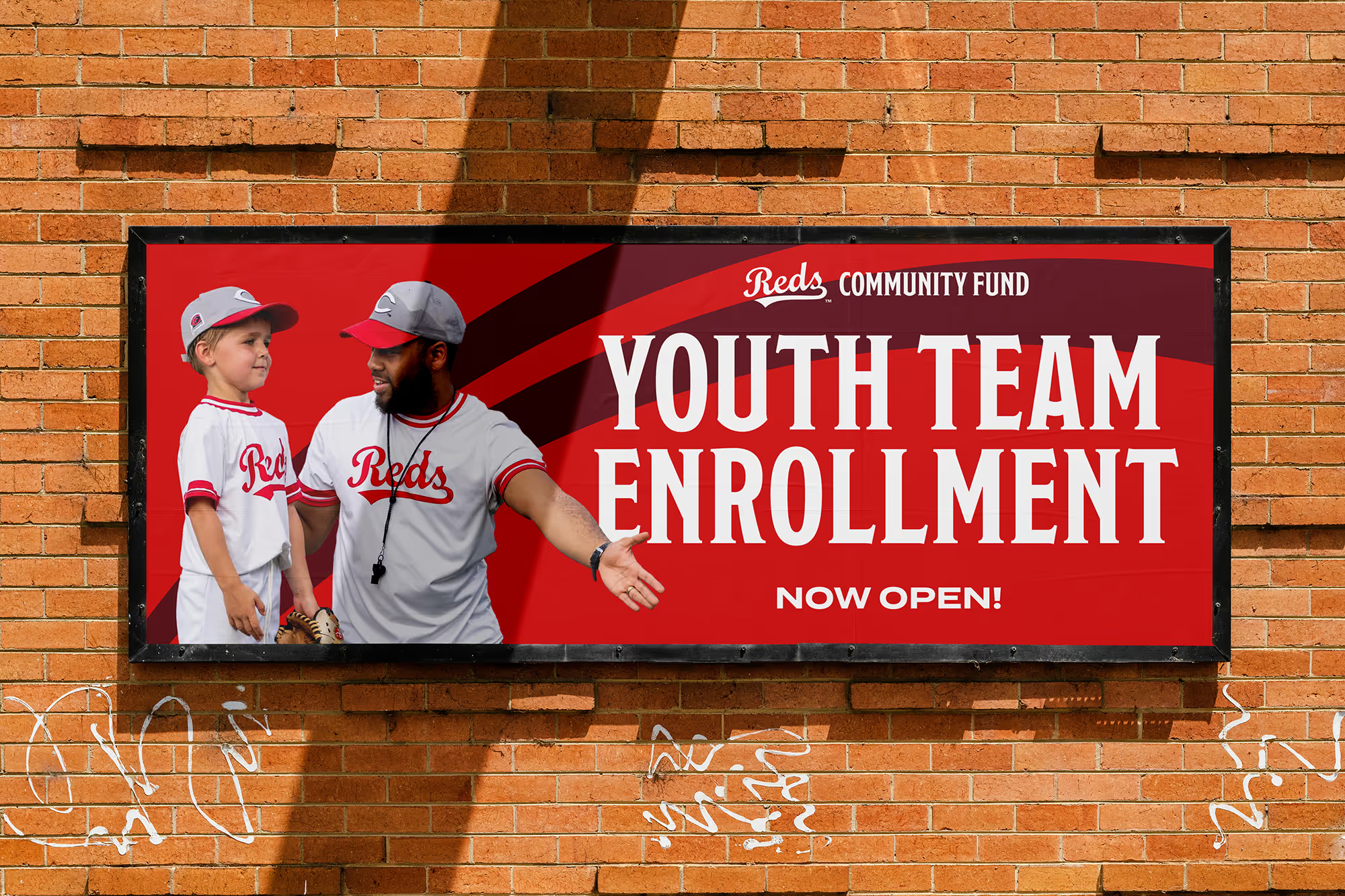
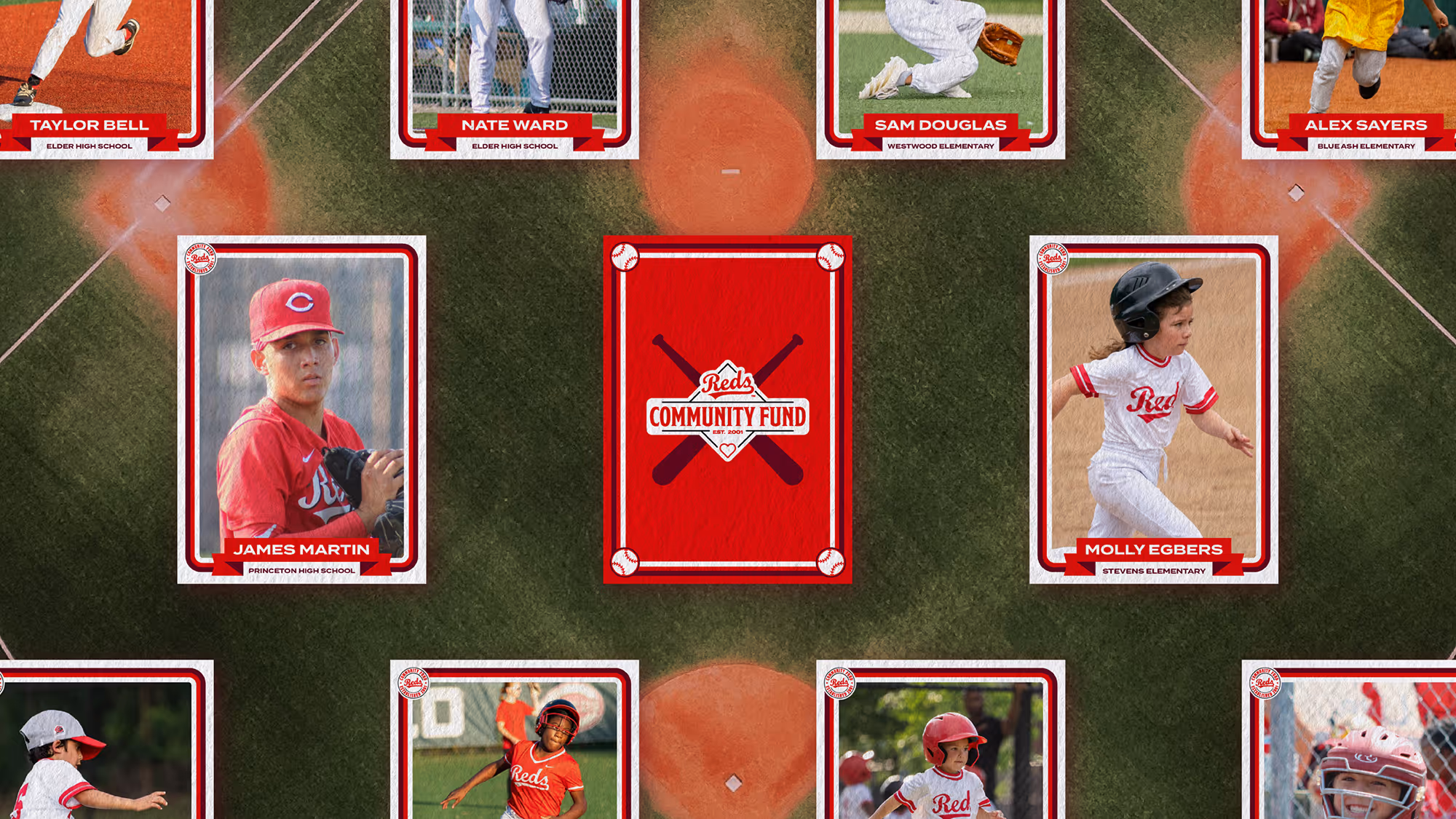
The Reds Community Fund mission is to improve the lives of underserved youth by leveraging the tradition of the Cincinnati Reds through baseball, softball, education, and community-building initiatives. The fund's outreach provides educational and personal development opportunities to help improve the futures of children aged 4–18.
They sought to solidify their identity, clarify their value proposition, and reestablish relevance among both the local community and donors.
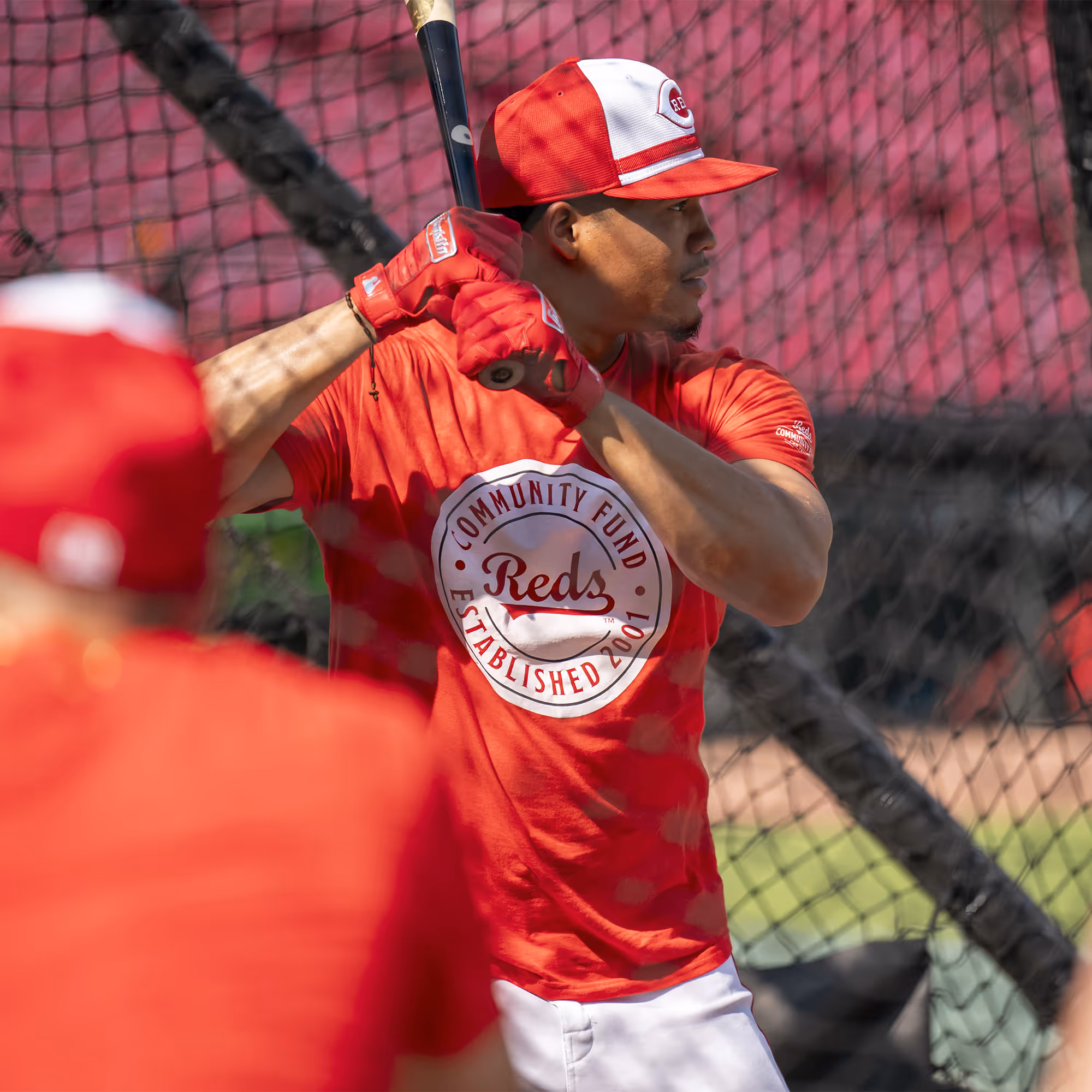
We developed a clear and compelling messaging strategy centered on the Reds Community Fund's unique value. From there, we built a refreshed visual identity—including a new logo and flexible system—designed to unify all their touch points and better align with other Major League Baseball foundations.


.gif)