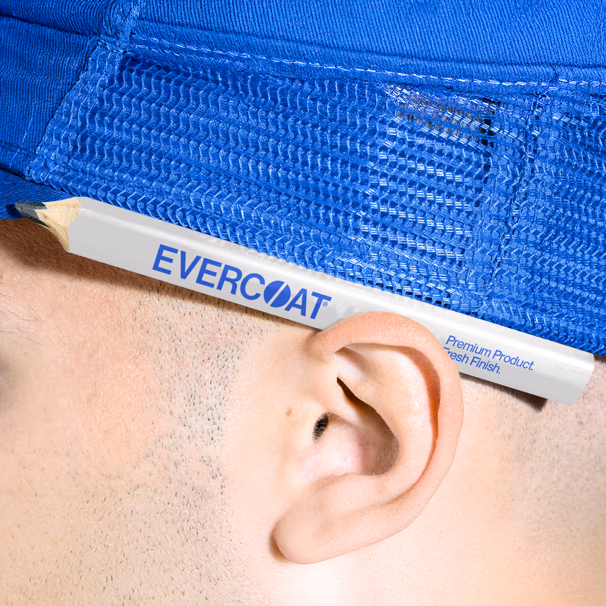
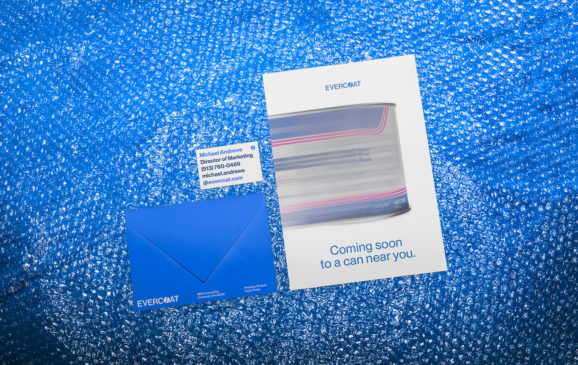
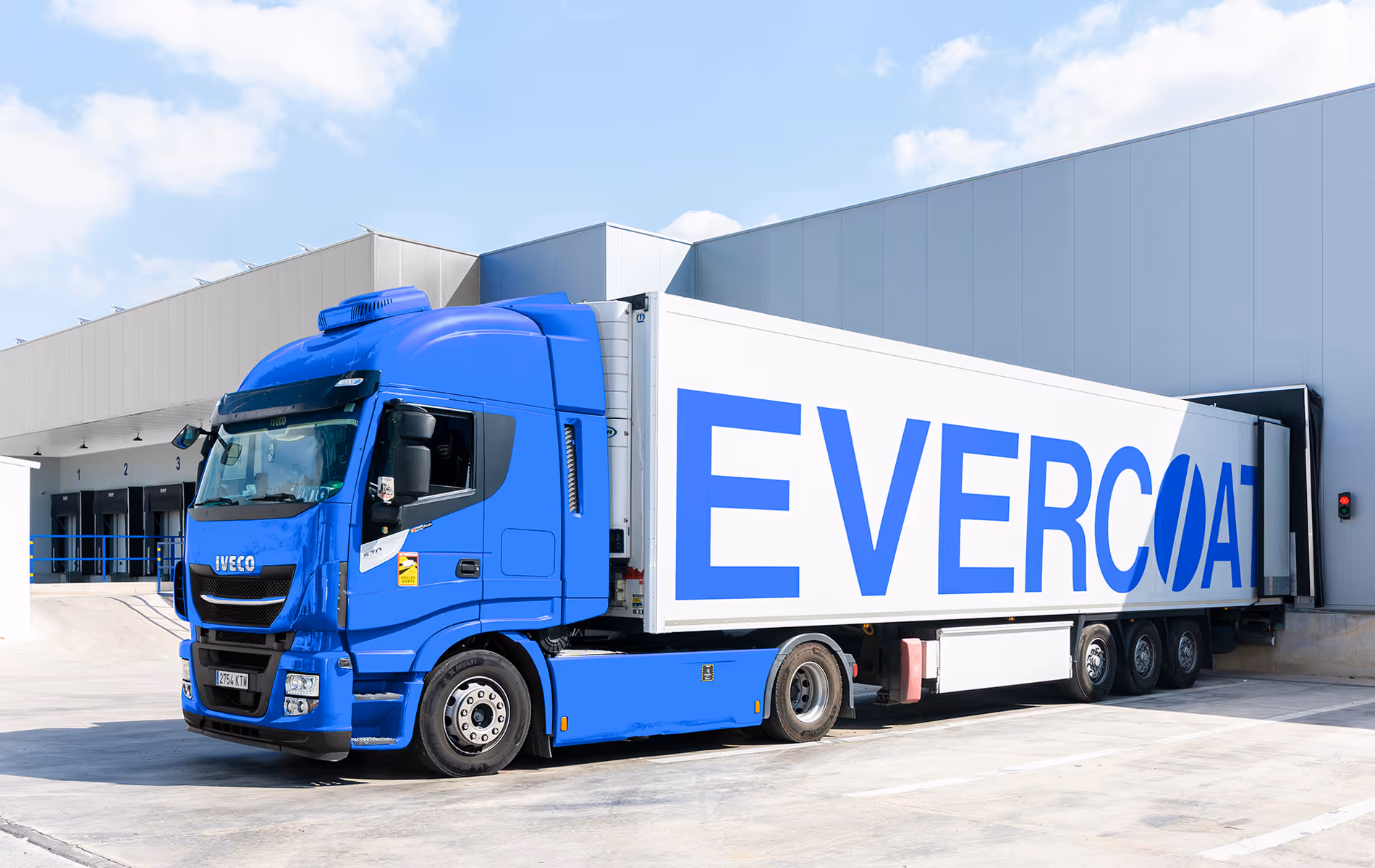
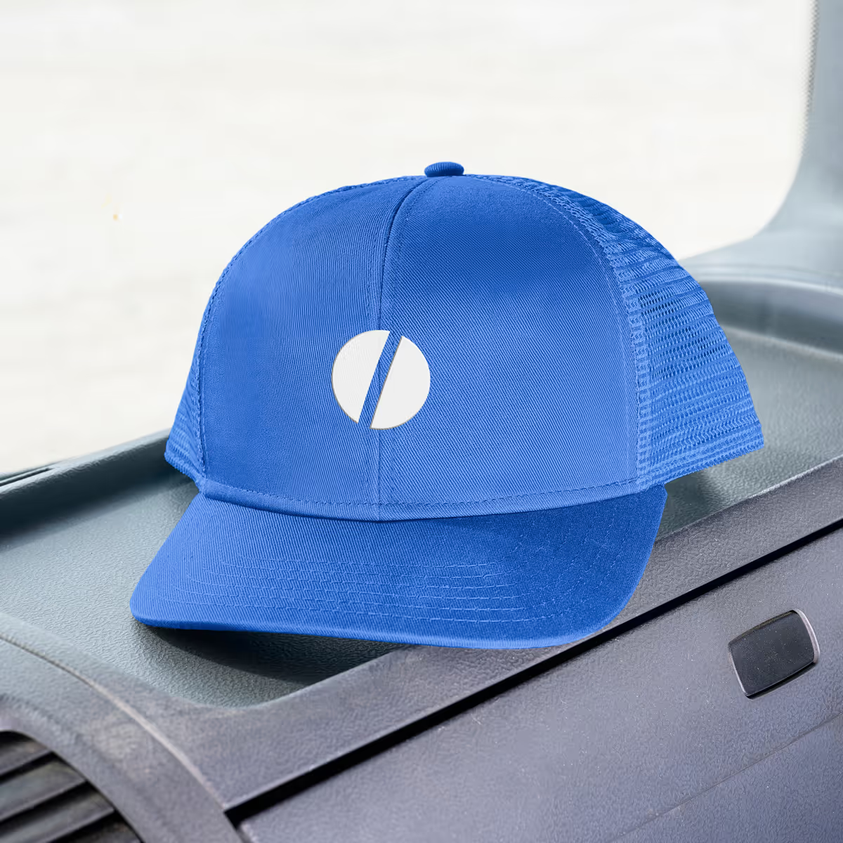
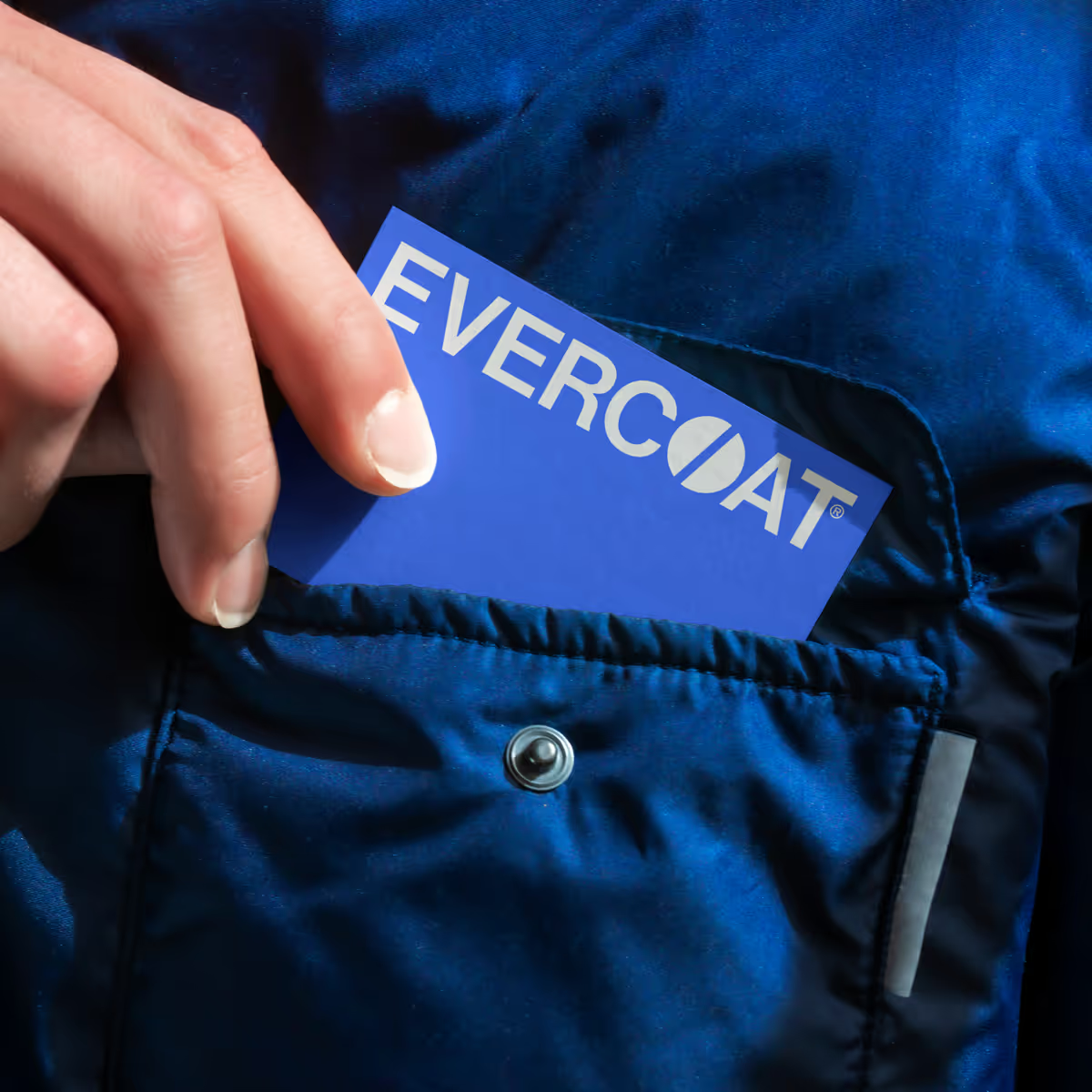
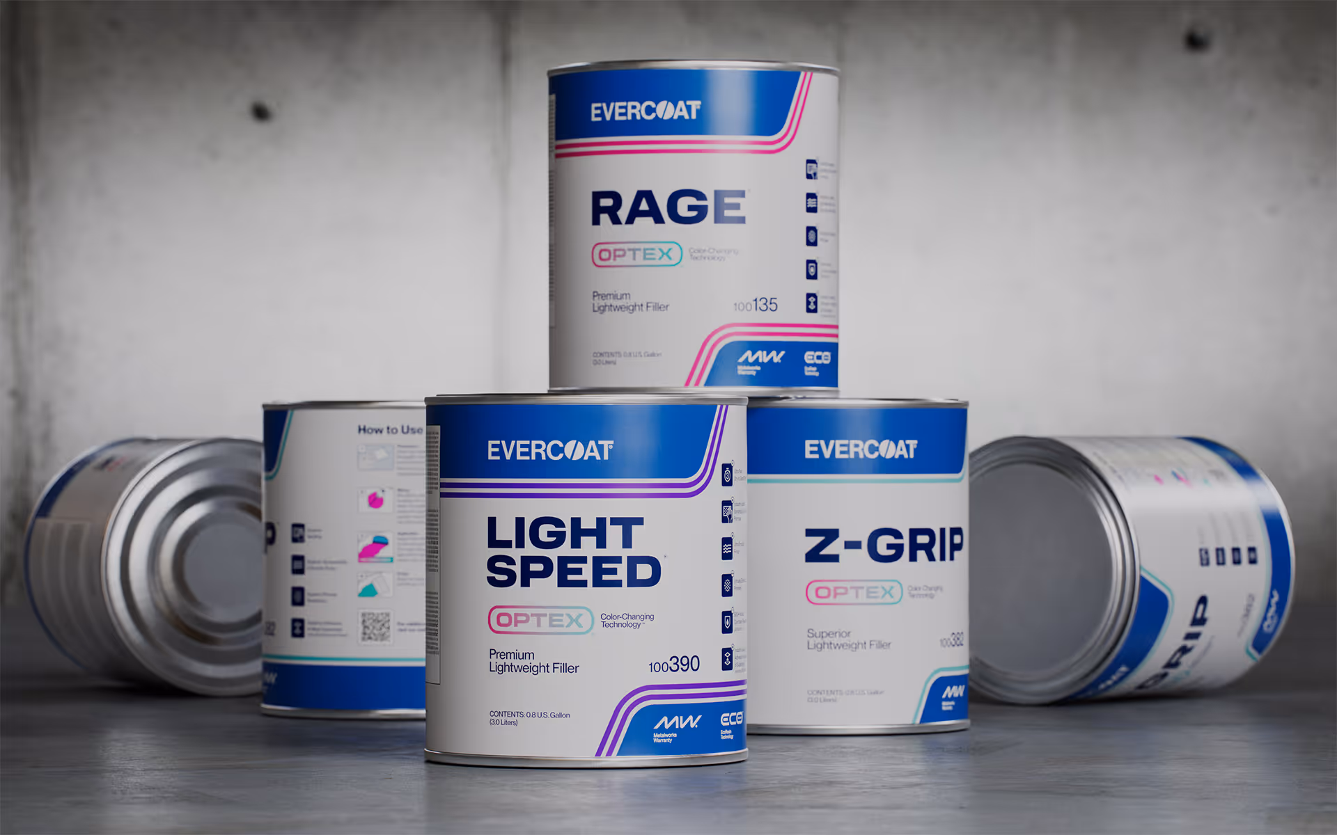
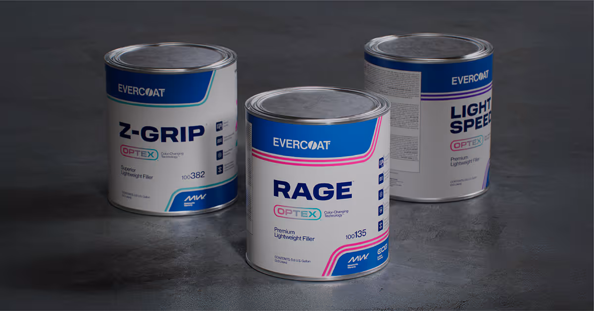
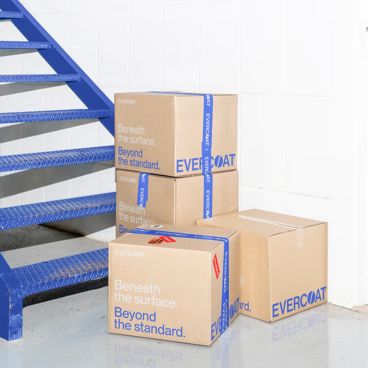
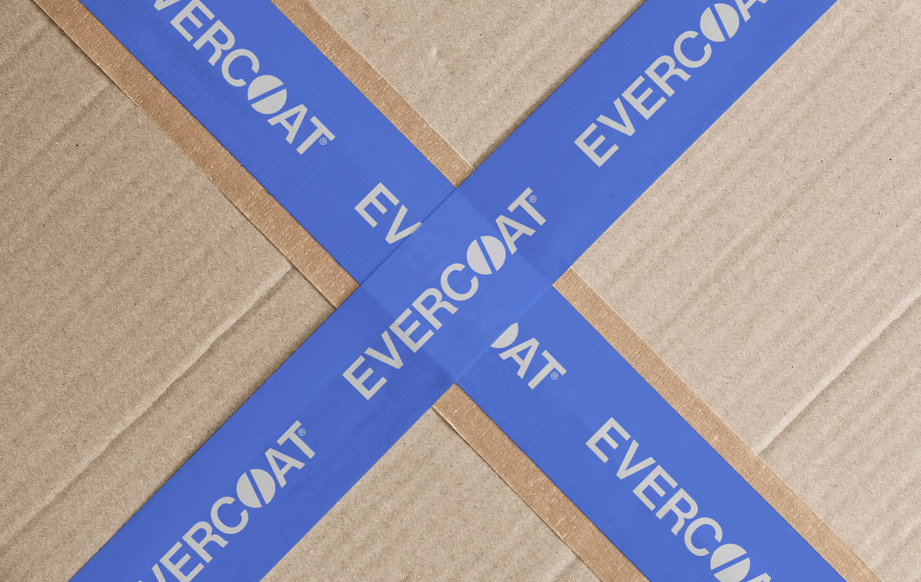
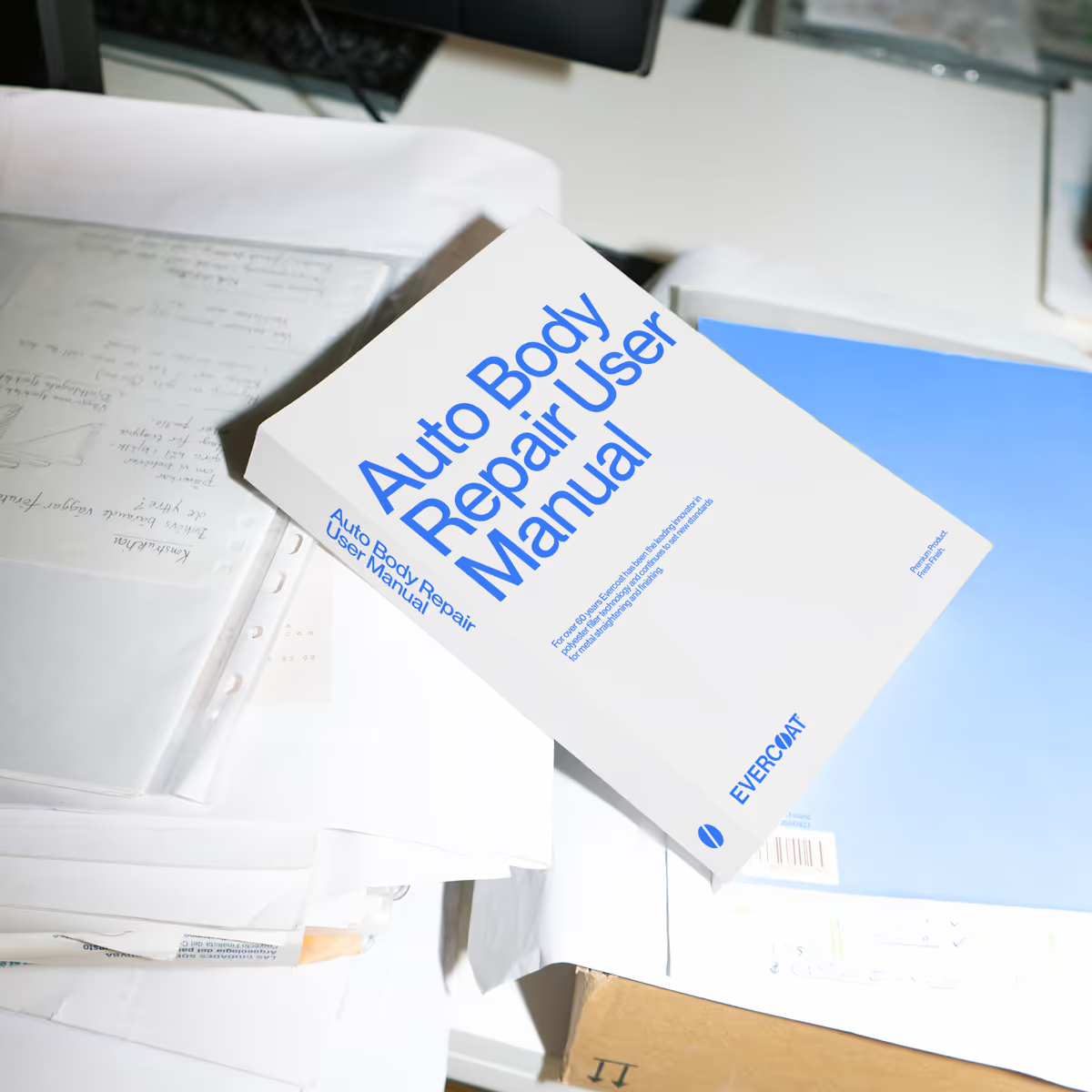
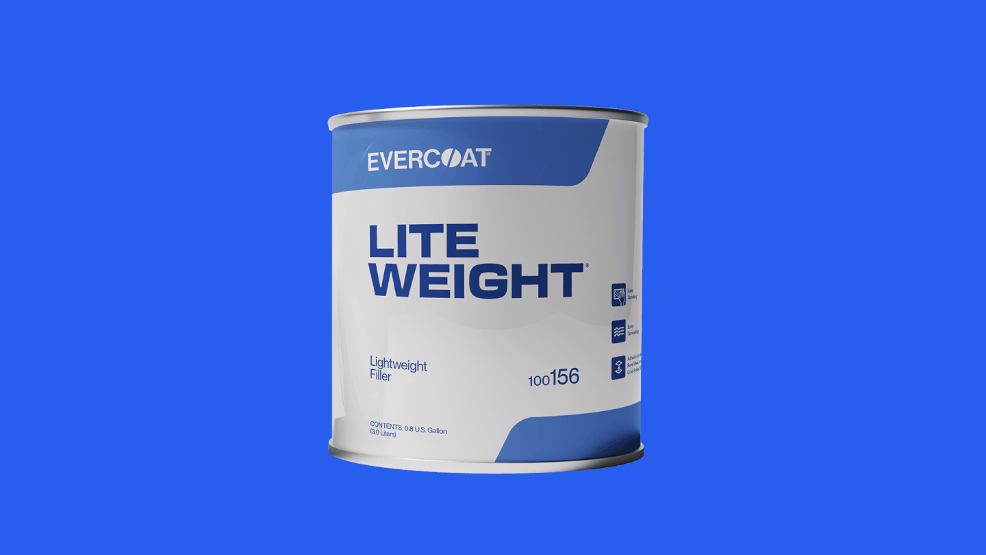
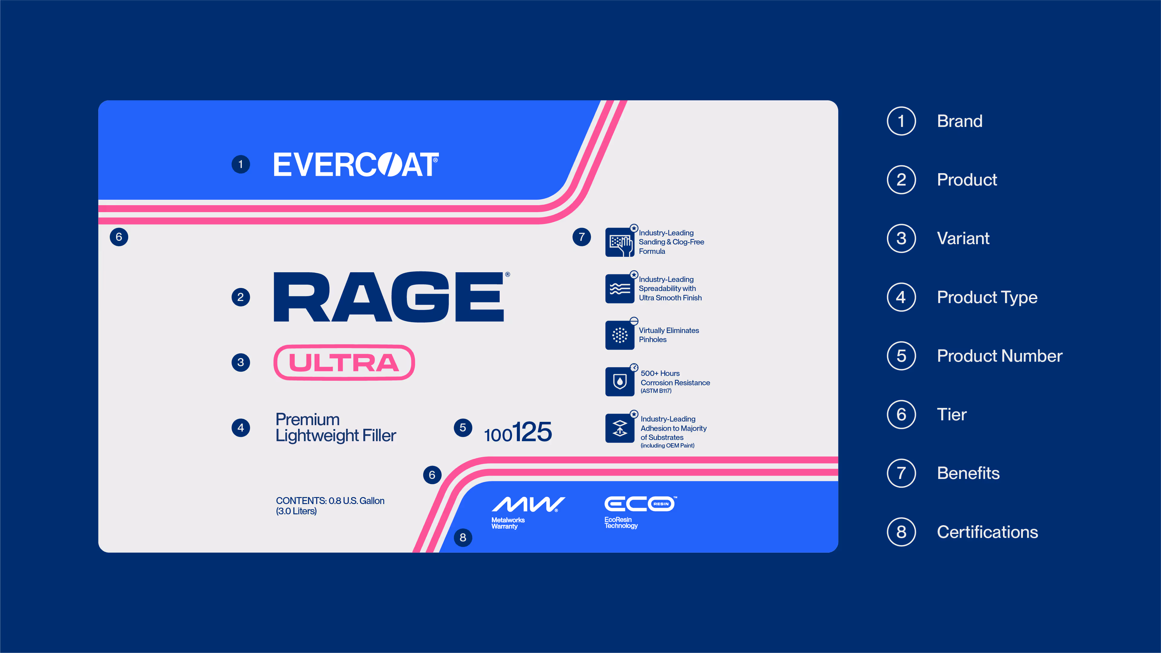
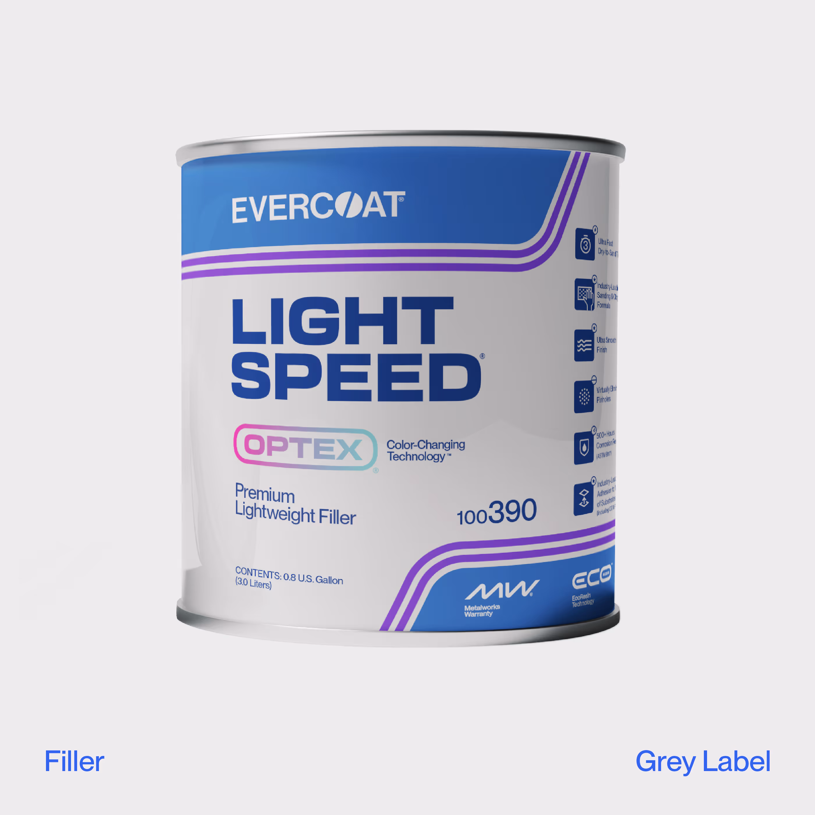
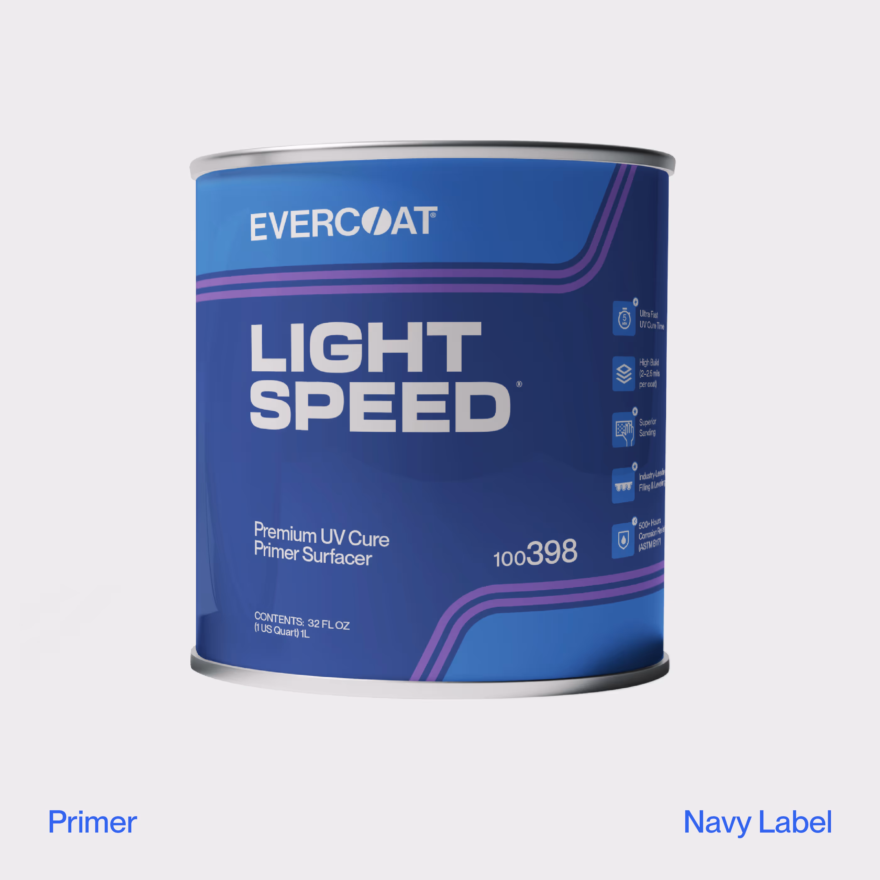
BRANDING
PACKAGING

Evercoat

Simplifying a disconnected portfolio and design system to refocus a category leader.

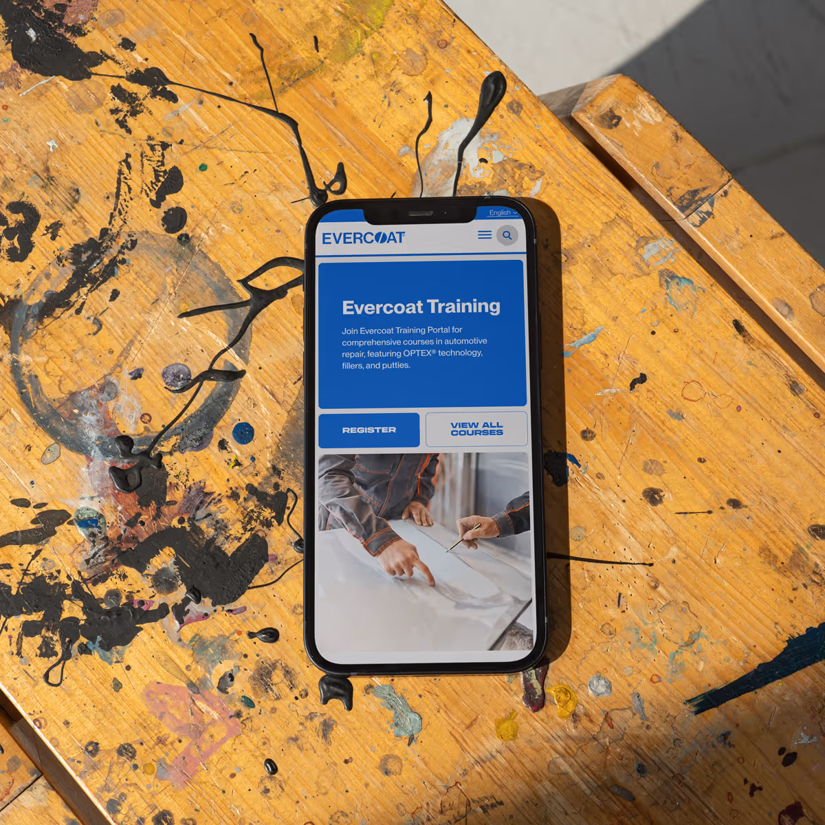
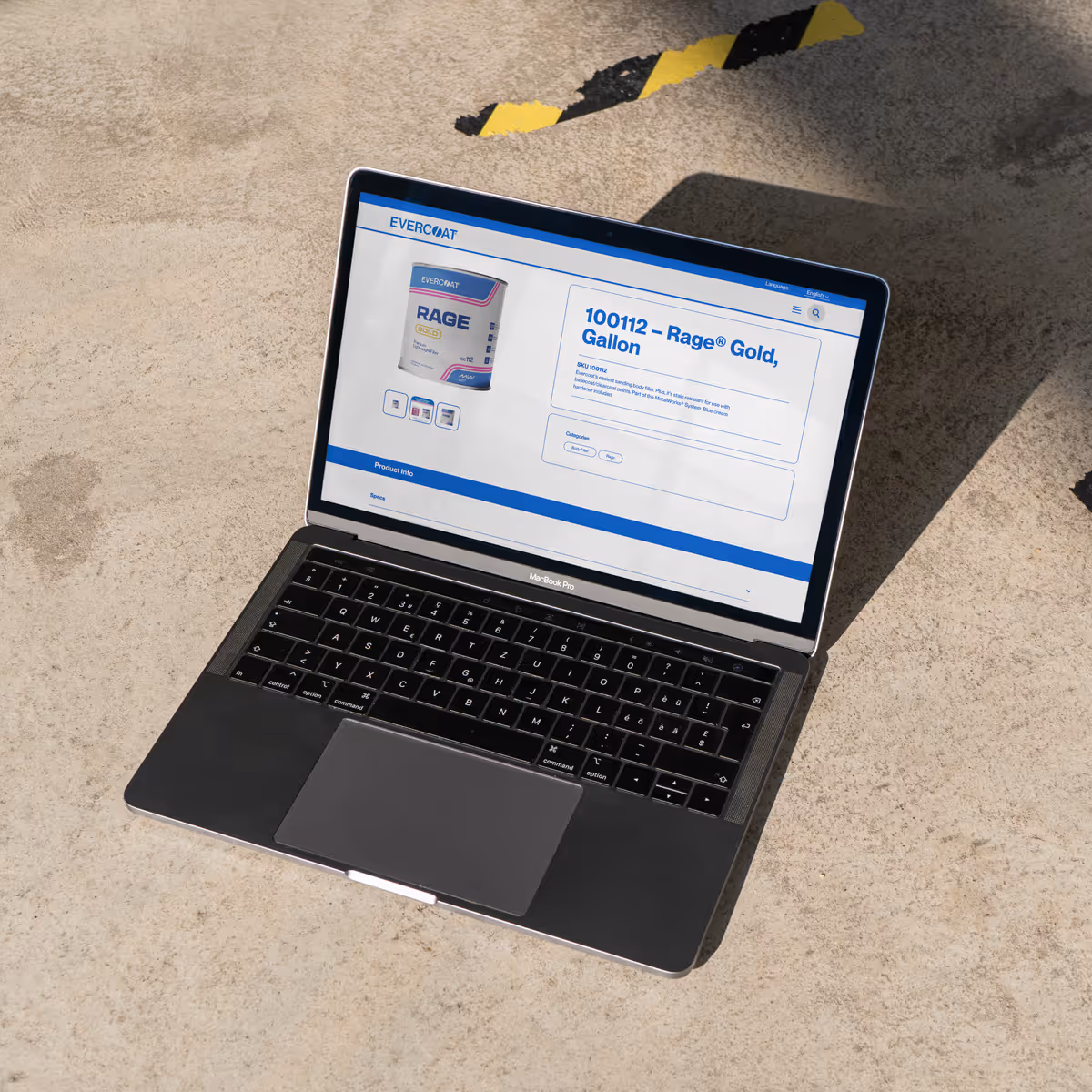
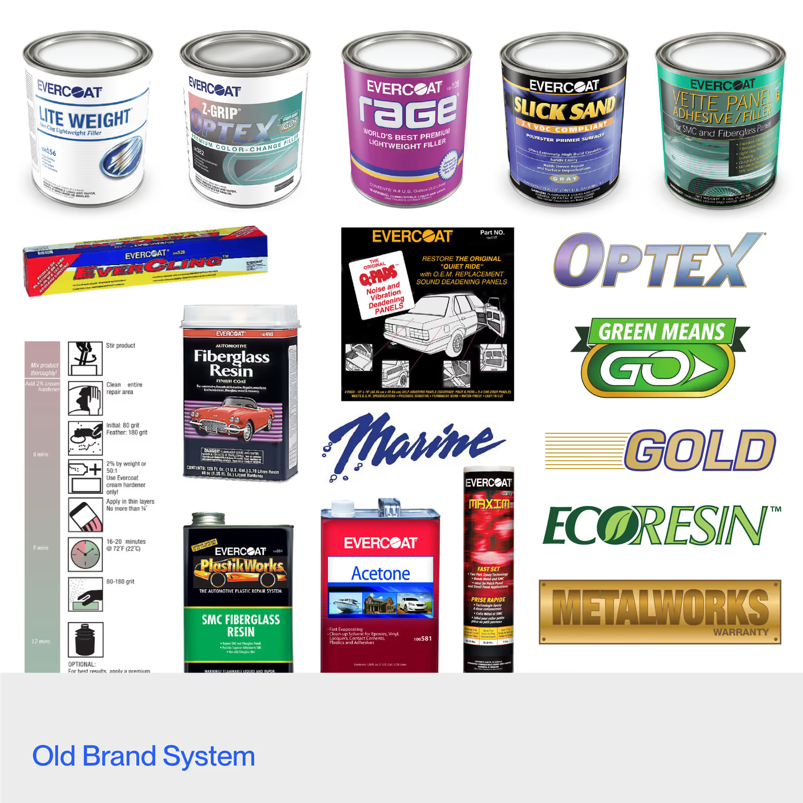
As a category leader in automotive surface repair, Evercoat’s sprawling portfolio had created a chaotic brand. Hyperquake consolidated the architecture into a tighter, more intuitive structure and streamlined the visual identity through a refreshed packaging system. The transformation was accelerated by a strategic marketing plan powered by social and influencer-led content, performance-driven initiatives, and updated traditional collateral. Together, we brought clarity to complexity—ushering in a more cohesive era for the Evercoat brand.

OUR ROLE
Brand Strategy
Positioning
Brand Identity & Guidelines
Packaging
Web & Mobile (UX/UI)
100+
Products across multiple categories
835%
Increase in organic social engagement within the first month
805%
Increase in organic social reach within the first month
The Evercoat logo draws from its catalyzation process—the precise filler-to-hardener ratio that activates the product. We refined the mark to highlight this signature detail and reinforce its leadership in the category.
Hyperquake introduced a functional packaging system that clarifies the tiering and benefits of each product in the portfolio. By using consistent name placement, variant badge designs, and racing lines to denote product distinction, their offerings can now be tiered in either a Good (0 stripes), Better (1 stripe), or Best (2 stripes) level.
Evercoat's primary products are its Fillers and Primers, which come in the same size packaging. In previous iterations, these were nearly indistinguishable. The new packaging system inverts the colors to maintain the hierarchy and clarity of the information, but quickly distinguishes the product type. The color shift allows technicians to quickly grab the right product in hectic environments.
Hyperquake helped Evercoat design and establish certification badges for their products that elevate them "beyond the standard" and add credibility to the system.